Editing complex scenes just got simpler! With Hide and Show, you can focus on specific assets without removing or rearranging anything in your scene.
Here’s what’s new
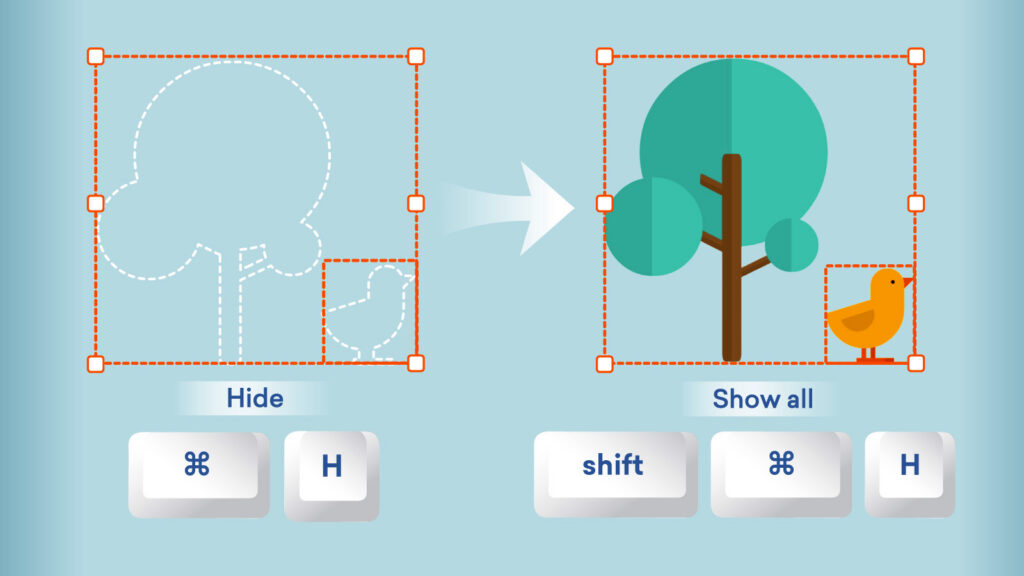
- Easily hide overlapping assets to reduce clutter and access hard-to-reach elements when composing a scene.
- Select an asset and Hide in the asset view.
- Unhide with ease by selecting Show on assets individually in the Arrange menu, or use Show all.
- Hidden assets stay hidden across sessions, previews, and generated videos.
- You can use the following shortcuts too:
| Function | Windows shortcut | Mac shortcut |
|---|---|---|
| Hide / Show | Ctrl+H | ⌘ H |
| Show all | Shift + Ctrl + H | Shift + ⌘ H |
Dive into edits without distraction. Available now in Vyond Studio to all plan types.
Learn more about hiding and showing assets >
Share your feedback:
Please fill out a one-minute survey and help us continue to provide high quality Vyond experiences.