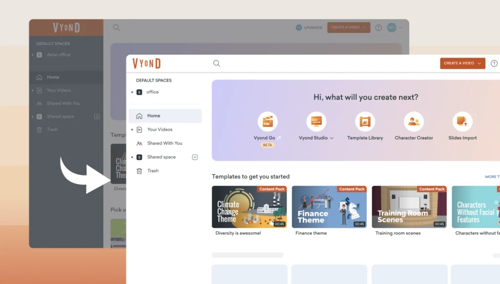
At Vyond, one of our priorities is to make our product easy to use and accessible. Hence, we are happy to announce an improved overall color contrast across our video lists and within the Studio, so that text and icons stand out more and are easier to read, see, and understand. Check out our new look in Vyond Studio.
We are continuously adding accessibility improvements, so stay tuned for more!
Share your feedback:
Please fill out a one-minute survey and help us continue to provide high quality Vyond experiences.