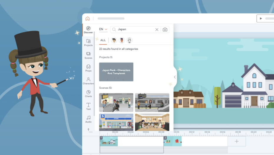
Since we launched global search we have received lots of really useful feedback and insights on how the panel is being used. Each piece of feedback has been thoroughly reviewed by our product team and we are striving to make the global search even better, with more improvements and enhancements on their way. Stay tuned for more!
Here is a list of our newly added enhancements:
- Scrollable left sidebar with active tab highlight so you know which tab you’re on
- Clickable breadcrumbs to get back to the previous browsing layer more easily
- Arrow icon on the collapsible content panel so you can hide the library and focus on your video project
- New, sleeker icon for the “ALL” style tab
Share Your Feedback:
Please fill in a one-minute survey and help us continue to provide high quality Vyond Studio experiences.